Menu design ideas for restaurants and cafés, with examples
The best menu design ideas start with how your menu is read, not with colours. A thirty-dish mezze list, a six-item burger menu and a tasting menu each need a different layout. Below are fifteen ideas, each with a finished example you can open and use.
Layout ideas: match the page to the food
Most menus are a single column of dish, dots, price. That works, but it is the reason so many menus look the same. Changing the structure changes the whole feel of the page before you pick a single colour.
1. Dishes in cards for a long mezze menu
Thirty cold and hot mezze in one column is a wall of text. Set them two across in small cards and the eye scans the page in rows, the way a table orders them: a few from here, a few from there.
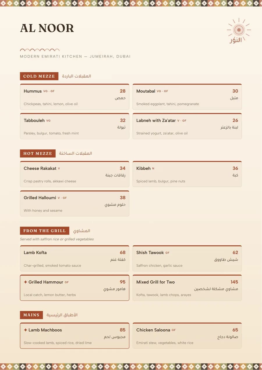 Beirut
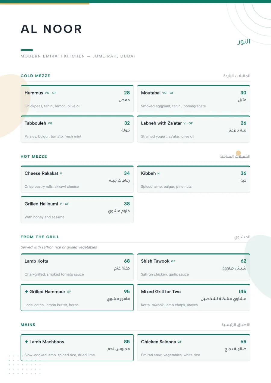 Marina
2. Ticket stubs for burgers and street food
A short menu with bold names and one price each suits a ticket or order-slip look. Each dish becomes its own block, which makes a six-item menu feel deliberate rather than thin.
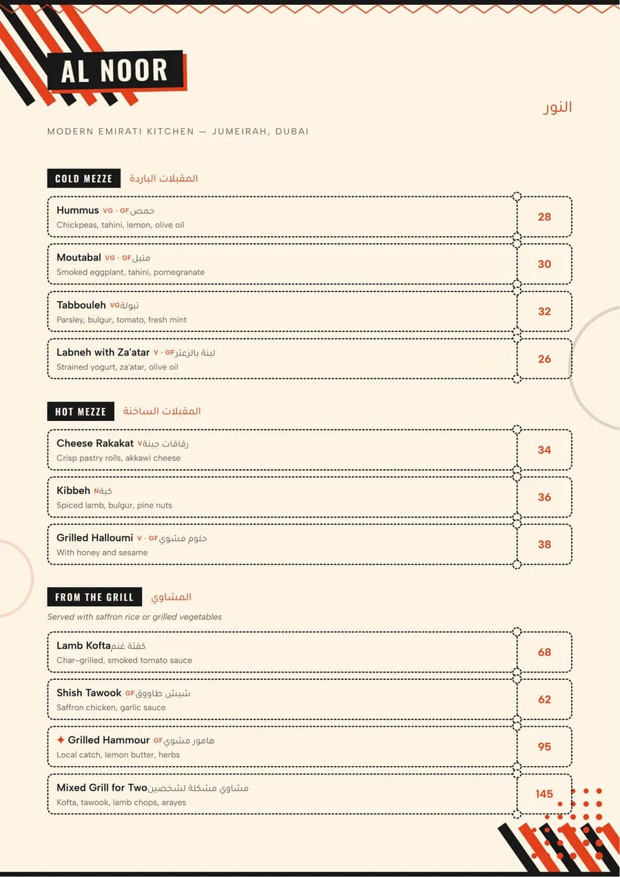 Bold Stack
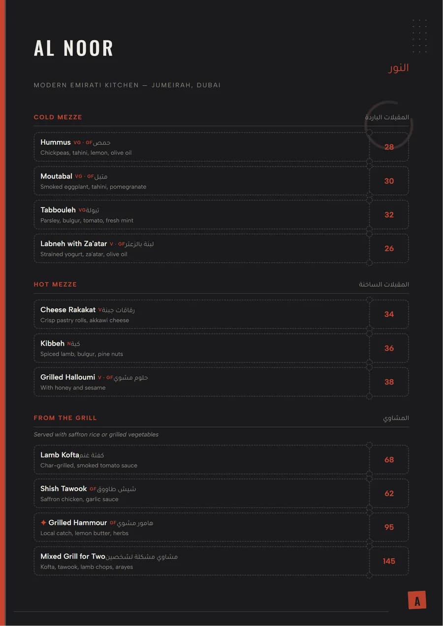 Tokyo Ash
3. Arches over each section for Indian and Pakistani menus
A long curry house menu needs strong section headings more than anything. Framing each heading under an arch gives the page rhythm and makes biryani, karahi and breads easy to find.
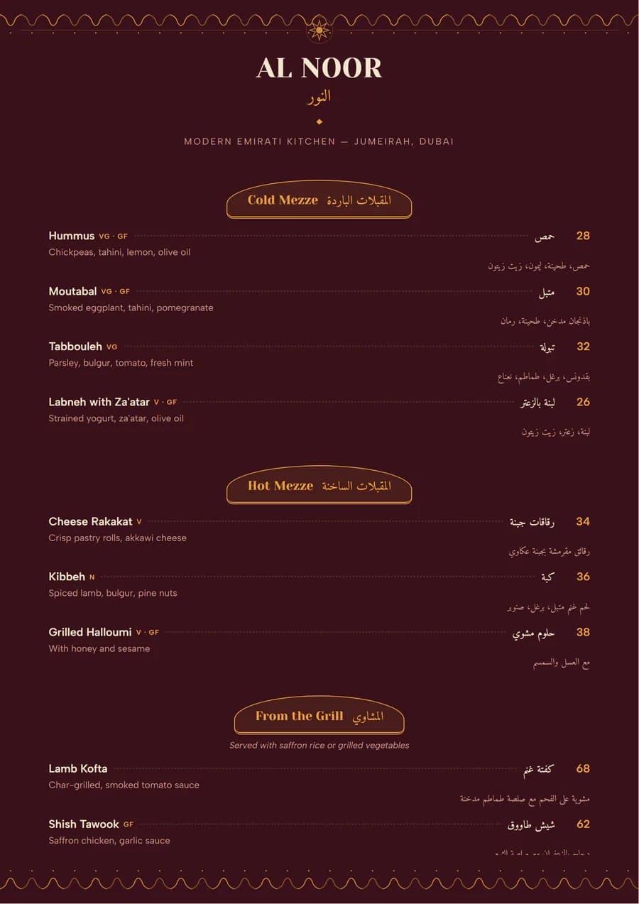 Karahi
4. A zigzag for pizza, pasta and bowls
Alternating dishes left and right breaks up a list of similar items. It suits menus where every dish has a one-line description and guests read rather than scan.
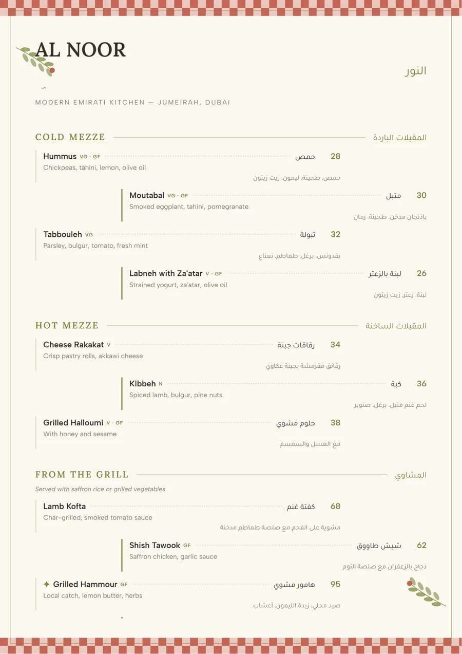 Trattoria
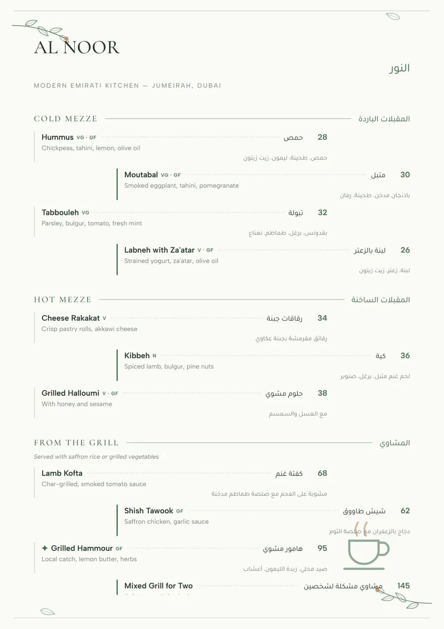 Botanica
5. A coloured side rail for seafood and grills
A band of colour down one edge with the section names on it works like tabs in a folder. Guests jump to Grills or Fish without reading the whole page.
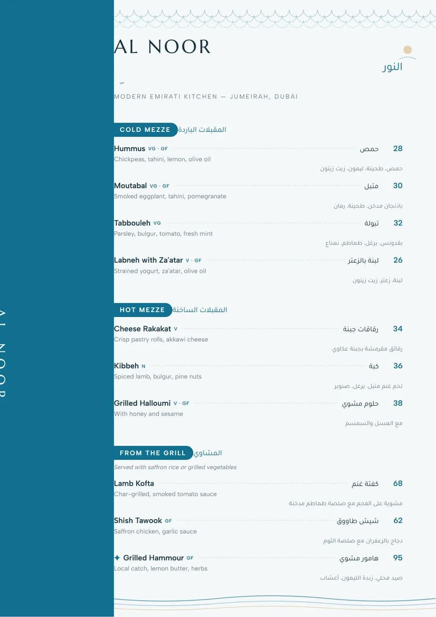 Corniche
6. Centred and quiet for fine dining
A tasting menu is read course by course, so centre everything, drop the dot leaders and give each course room. Prices can sit under the dish or once at the bottom for a set menu.
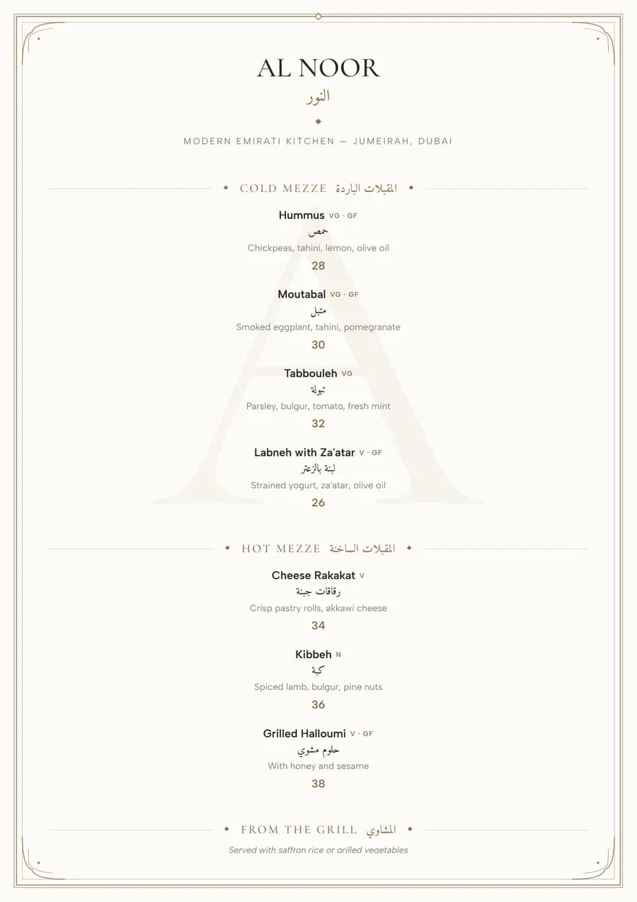 Ivory
Ivory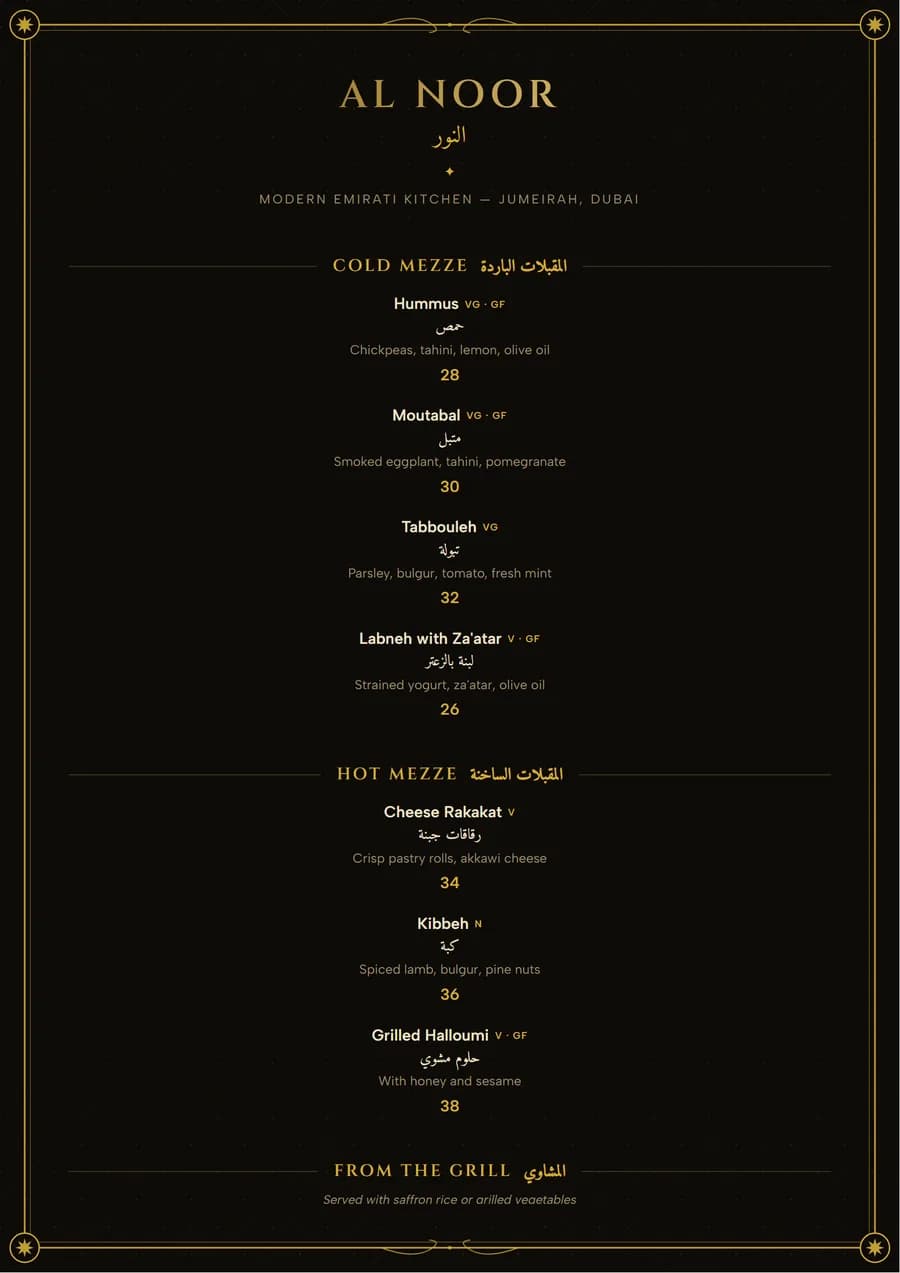 Majlis Royale
Style ideas: give the menu a sense of place
7. Gold on a dark ground for lounges and night venues
Shisha lounges and bars are dim. Pale gold or cream type on a dark page stays readable under low, warm light, where grey text on white disappears. Keep the type a size larger than you would on a daytime menu.
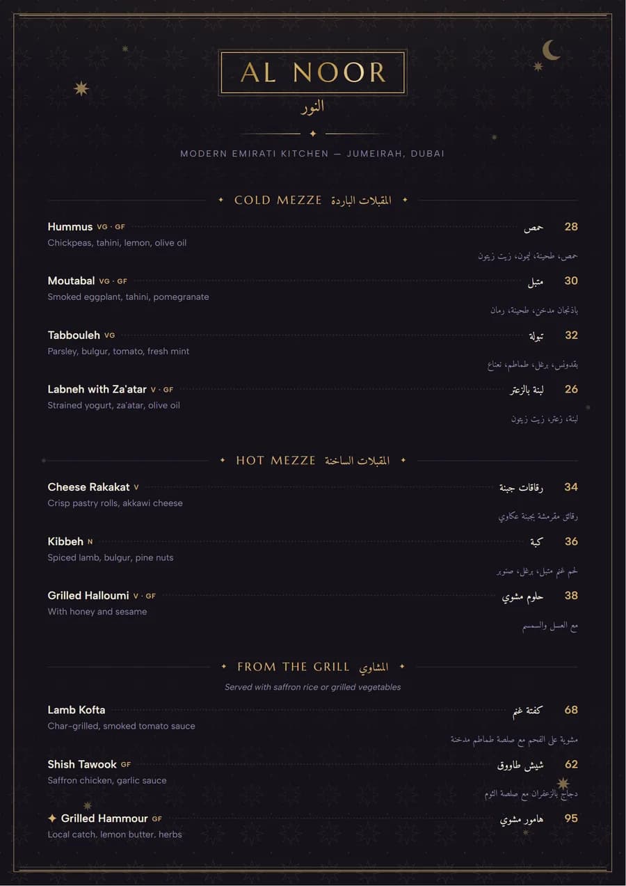 Layali
8. A heritage pattern for Emirati and Khaleeji food
A band of Sadu weave or a dhow motif tells a guest what kind of kitchen this is before they read a word. Use the pattern at the edges and keep the middle of the page calm, so the dishes stay the focus.
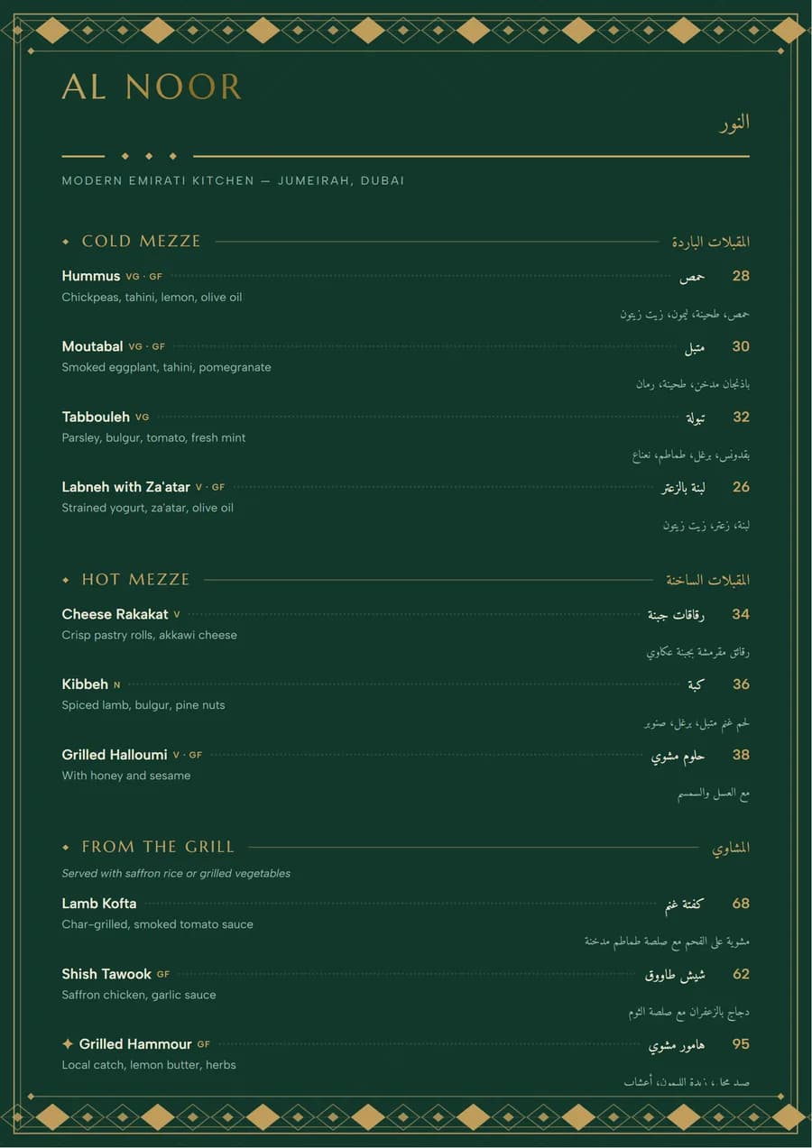 Sadu
Sadu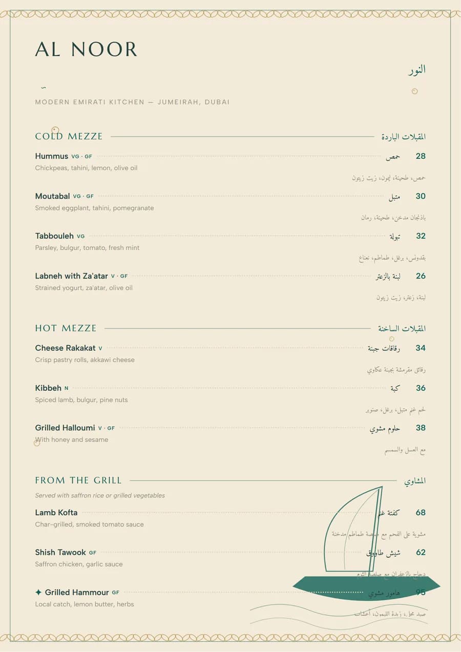 Al Dhow
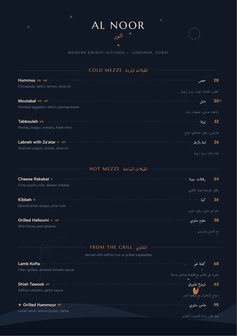 Kashta
9. A vintage, typewritten feel for bakeries and bistros
Typewriter type and a slightly aged paper colour suit a bakery café or a French bistro, where the menu should feel handmade rather than corporate.
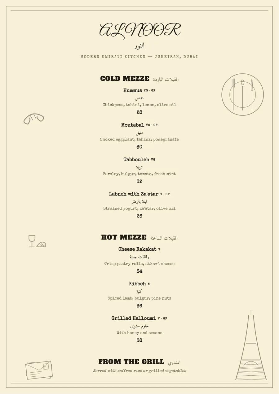 Petit Bistro
Ideas that sell more, on any design
10. Highlight one dish per page
A star, a box or a line of colour next to one dish draws the eye straight to it. Pick a dish that sells well and earns well. Highlight five and none of them stands out. The menu design guide explains how to choose which.
11. Drop the currency sign
Write 95, not AED 95, and say once in the footer that prices are in dirhams and include 5% VAT. A 2009 Cornell study found diners spent more when prices were plain numbers. In the UAE, the prices themselves must include VAT.
12. Put the extras in one note
Oat milk, extra cheese, add chicken: write them once under the section heading instead of on every dish. The list gets shorter and the add-ons still get seen.
13. Give Arabic its own page, or mirror the whole layout
On a bilingual menu, either set English and Arabic side by side at equal size, or print an Arabic version where the whole page runs right to left. A small Arabic line under each English name reads as an afterthought. See Arabic menu design.
14. A trifold for takeaway
A folded A4 sheet fits a delivery bag, a DL envelope and a hotel room. Put the best sellers and your phone number on the front panel, the full menu inside. See trifold menu templates.
15. Match the QR code card to the menu
The table card with the QR code is part of the menu design. Print it in the same colours and type, and make sure the menu that opens on the phone looks like the printed one. See QR code menus.
Small restaurant menu ideas
A small kitchen does better with a short menu, and a short menu is easier to design well. Aim for one A4 page or an A5 card, four or five sections, and six to eight dishes in each. Print drinks and desserts on a separate DL card: they change price more often, and reprinting a slim card costs less than the whole menu. For coffee shops, the café menu templates page has ideas specific to cup sizes and extras.
Menu design idea questions
What makes a good restaurant menu design?
A guest can find what they want in a few seconds and notices the dishes you most want to sell. That comes from structure more than decoration: sections in the order people eat, short sections, one highlight per page, prices that do not dominate, and type large enough to read in your dining room's lighting.
How can I make my menu look more attractive?
Choose a layout that suits your food before choosing colours, give the page more space than feels necessary, use one accent colour, and cut dishes rather than shrinking the type. A heritage pattern, a dark ground or a coloured rail adds character, but only one of them per menu.
What are good menu ideas for a small restaurant?
Keep it to one A4 page or an A5 card with four or five sections and six to eight dishes in each. Put your two best sellers at the top of their sections, mark one house special, and print drinks separately on a DL card so the main menu does not need reprinting when drink prices change.
Should a menu have pictures of the food?
Photos can help on a delivery app or a casual menu with unfamiliar dishes, but on a printed dine-in menu they take the space of several dishes and often make a restaurant look cheaper. A short, specific description usually does the same job in less space.
Every example on this page is one of the restaurant menu templates, and each one works in English, Arabic or both.
Found an idea you like? Open the template and put your own dishes in it.