Who the Ivory template is for
- Tasting menus
- Chef's tables
- Hotel restaurants
- Set dinners and pairings
Why it looks the way it does
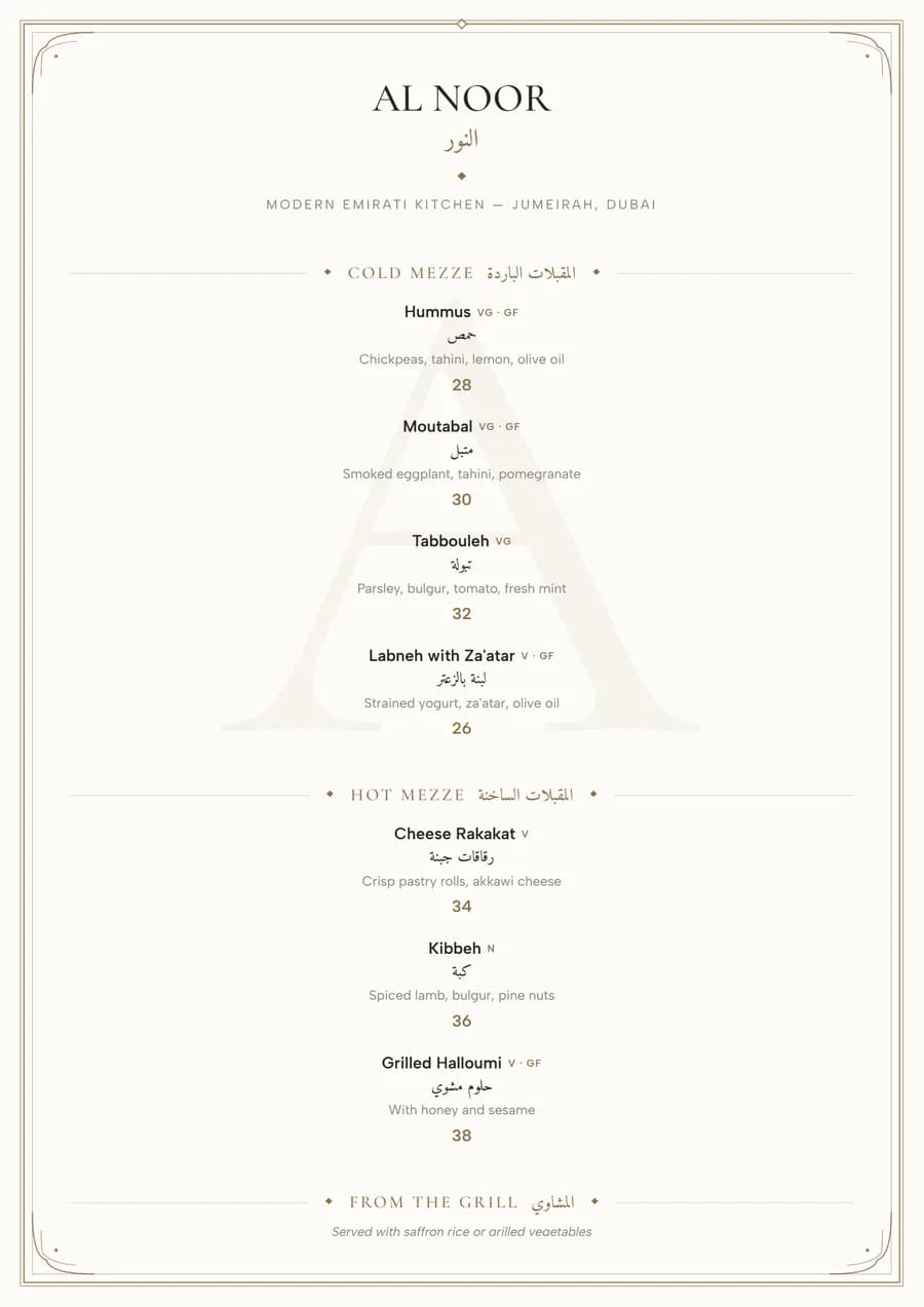
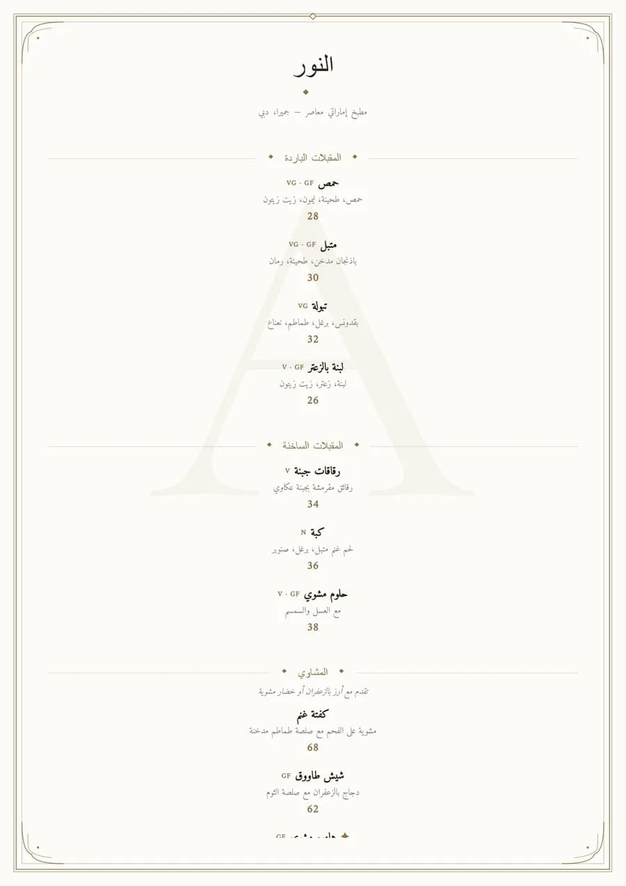
Everything on Ivory is centred and set in Cormorant Garamond, a high-contrast serif that reads as expensive at small sizes. The price sits on its own line under each dish instead of at the end of a row of dots. That is deliberate: a tasting menu is read course by course, top to bottom, and nobody should be scanning the right-hand edge for the cheapest option. A thin rule frames the page, filigree curls mark the corners, and your restaurant's initial sits faintly behind the text as a watermark. Leave plenty of empty space. On this design it is the point.
Arabic and English on the same menu
The Arabic is set in Amiri, a classical Naskh with the same calligraphic swell as Cormorant, so an English course and its Arabic translation look like they were cut from the same page. On a bilingual menu the Arabic sits directly under each English line.
Sizes to print it in
A single A4 page suits a set menu of five to eight courses. For à la carte with a longer drinks section, use an A5 booklet. Every template exports as a print-ready PDF at exact size with 3 mm bleed and crop marks. The menu printing guide lists the specs your print shop will ask for, and menu sizes for printing compares the formats.
The same menu as a QR code
Publish a menu made with Ivory and it also becomes a QR code menu that keeps these colours and headings on a phone, with an Arabic and English switch and WhatsApp ordering. How the QR menu works.
Similar templates
All restaurant menu templates · Trifold menu templates · Pricing